Revolutionizing the School of Media, Arts, and Design's Application Process at James Madison University.
My Role: UX Designer & Researcher
Methods & Tools: User Research & Testing, Ideation, Wireframing, Paper Prototyping, Low-Fidelity Prototyping, and Axure.
Goal: Improve the experience for students applying to the School of Media, Arts, and Design (SMAD).
Problem
Applying to the SMAD program is more complicated than it should be. As a student who utilized the paper system to get into the program, I was aware of the pitfalls in the process. Digitization transforms this antiquated system into a streamlined intuitive process.
User Research Results: Interviews
“I remember it being super frustrating. The folder they give you had numerous papers in it which I was worried about losing and keeping tidy.” -Taylor
80%
Found the process to be stressful/frustrating.
80%
Needed help completing to application.
60%
Would change something about the process.
Findings from our research and interviews found the application process to be:
Draining of resources.
Not thoroughly explained in one easy-to-find place.
Not ergonomic.
Overwhelming to the main office.
Difficult for individuals with disabilities.
Impact/Solution
Research shows that students see issues in the process of applying for the program. Creating an online portal for students’ applications makes the process more accessible, cuts down on time and resources needed, minimizes waste, and overall eases an already stressful application process for students.
Task Analysis
Users need to be able to:
-
Access all requirements
-
Start the application early and return to it later on
-
Send all or only some of her application files to her boss, friends, etc. for them to review
-
Personalize notifications
-
Submit one requirement at a time
-
Receive feedback that tells her what she’s completed, what she hasn’t, and if her submissions have been received
-
Review submissions

IA & User Flow

Design Requirements
We formed a list of design requirements based on extensive research into other application sites, user research, user goals, and visualizations. This gave us a platform to begin building the application.
User Requirements
-
SMAD applicant
-
In SMAD 101 class
Prerequisites
-
Complete SMAD 101
-
Take SMAD admission test
Contextual Requirements
-
Change of concentration or program application
Data Requirements
-
Number of applicants
-
Number of applicants in each of the concentrations
-
Available seats per application test
-
Student information – name, eID, year, GPA, SMAD 101 grade, test score, etc.
-
Documents to be submitted i.e. information form, transcript, letter, resume, question
Functional Requirements
-
Notifications with email, text, etc.
-
Submit documents
-
Send documents from the interface
-
Work on documents on the interface and save for later
-
Continuously updating list
-
Tooltips
-
Back buttons on the page
-
Home button
-
Text box/document
Sketches
We visualized the dashboard so that users, from a glance, receive immediate feedback as to what is complete and what still needs to be done.

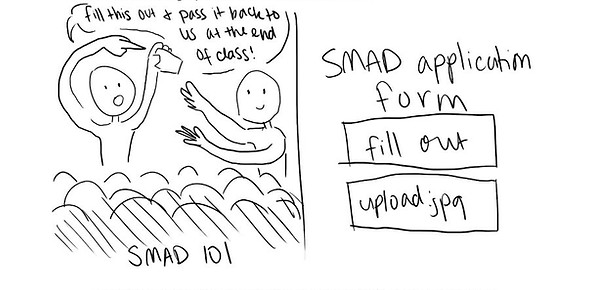
When speaking with the professor in charge of the application process we were informed that there was a paper form that was required to be handed into the main office, we brainstormed a way in which we could integrate this step into our interface by uploading an image or filling it out online to let the student confirm that they turned it into the office.

Paper Prototype
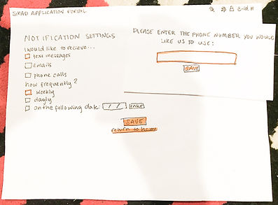
We began the design with a paper prototype for quick iterations and feedback.


Paper Prototype: Actionable Feedback
Add additional user feedback with task completion, especially with the notification settings page.
Utilize additional pop-ups to minimize pages needed.
Replace the ‘view’ link with the download, re-upload, and delete buttons.
Low Fidelity Prototype
Low-Fidelity Prototype: Test Results
Settings and share icons could be more visible.
Additional button clarification.
Increase navigation bar weight.
Add tooltips.
Improvements
With more time I would design a high-fidelity prototype implementing the feedback and continue to iterate.
Takeaways
-Keep iterating.
-Feedback for users is incredibly important.
-The questions asked dictate the quality of the research and testing.
